# Lesson 2 | Chatbot Customization
In this lesson, you'll learn how to customize your chatbot's behavior and look-and-feel. You'll learn how to display multiple chatbot instances.
# Modify chatbot behavior
Let's start by adding some specific options to our current chatbot.
return (
  <Chatbot
    width="600px"
    height="600px"
    config={{
      defaultContextTitle: "Sample Retail",
      suggestionsWelcomeText: false,
      welcomeText: false,
    }}
  />
);
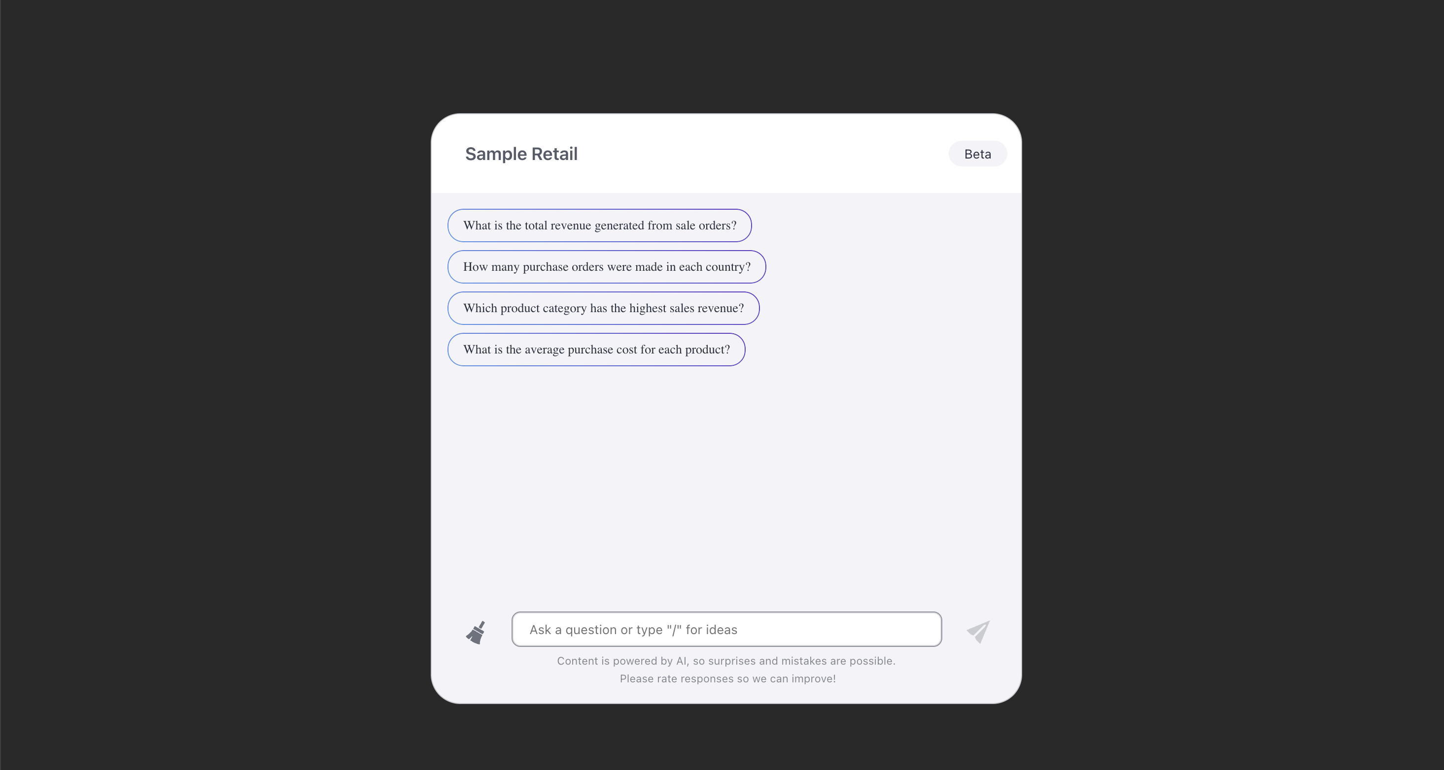
This resizes the chatbot, hides some text content, and skips the data topics screen by setting the default chat context to be "Sample Retail". Your app should now look like this:

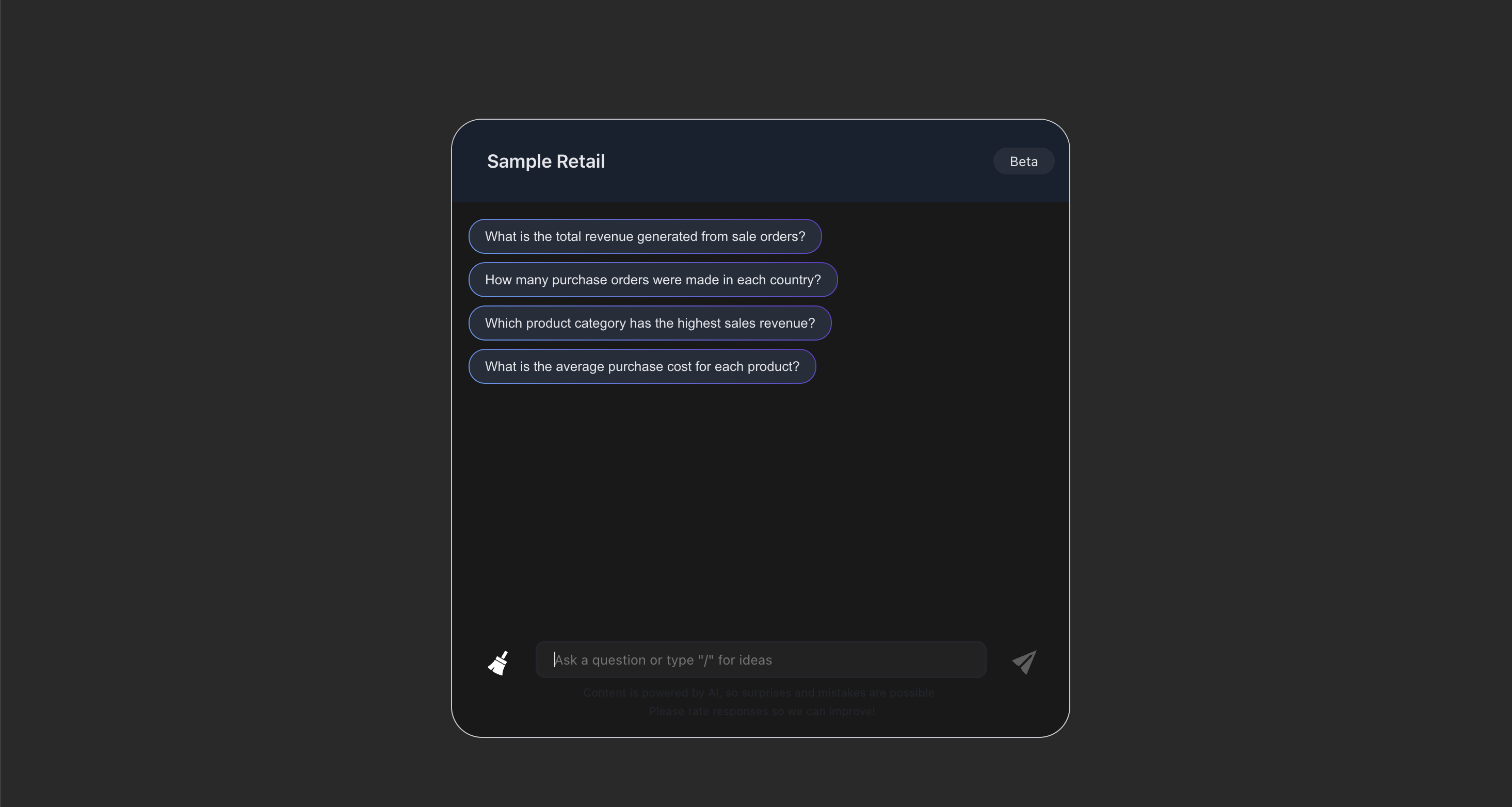
Let's change the look and feel of the chatbot and give it a dark theme. We'll need to wrap the chatbot in a ThemeProvider.
return (
  <ThemeProvider
    theme={{
      typography: {
        fontFamily: "Arial",
      },
      aiChat: {
        backgroundColor: "#121212",
        primaryTextColor: "#E5E7EB",
        userMessages: {
          backgroundColor: "#1E3A8A",
        },
        systemMessages: {
          backgroundColor: "#1F2937",
        },
        input: {
          backgroundColor: "#1C1C1E",
        },
        header: {
          textColor: "#E5E7EB",
          backgroundColor: "#0D1B2A",
        },
        suggestions: {
          textColor: "#E5E7EB",
          backgroundColor: "#1F2937",
          hover: {
            textColor: "#E5E7EB",
          },
        },
        clickableMessages: {
          textColor: "#E5E7EB",
          backgroundColor: "#1F2937",
          hover: {
            textColor: "#E5E7EB",
          },
        },
        icons: {
          color: "#FFFFFF",
        },
      },
    }}
  >
    <Chatbot
      width="600px"
      height="600px"
      config={{
        defaultContextTitle: "Sample Retail",
        suggestionsWelcomeText: false,
        welcomeText: false,
      }}
    />
  </ThemeProvider>
);
Your chatbot should now look something like this:

# Multiple chatbots
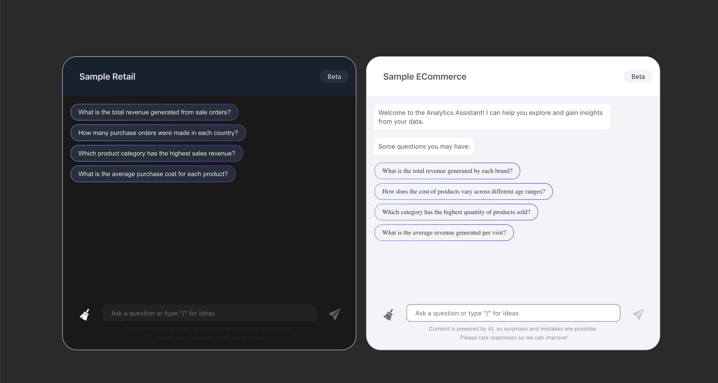
It'd be nice to have 2 chatbots side-by-side, pointing to different contexts. Let's render another chatbot that uses Sample ECommerce as its default model.
return (
  <div style={{ display: "flex", columnGap: "20px" }}>
    <ThemeProvider
      theme={{
        // ...
      }}
    >
      <Chatbot
        width="600px"
        height="600px"
        config={{
          defaultContextTitle: "Sample Retail",
          suggestionsWelcomeText: false,
          welcomeText: false,
        }}
      />
    </ThemeProvider>
    <Chatbot
      width="600px"
      height="600px"
      config={{
        defaultContextTitle: "Sample ECommerce",
      }}
    />
  </div>
);
With this code, the two chatbots are spaced apart on the same row. The Sample ECommerce chatbot is configured with the default behavior and styling.

# Code sample
Here's the complete App.tsx file after the past two lessons.
import { ThemeProvider } from '@sisense/sdk-ui';
import { Chatbot } from '@sisense/sdk-ui/ai';

function App() {
  return (
    <div style={{ display: "flex", columnGap: "20px" }}>
      <ThemeProvider
        theme={{
          typography: {
            fontFamily: "Arial",
          },
          aiChat: {
            backgroundColor: "#121212",
            primaryTextColor: "#E5E7EB",
            userMessages: {
              backgroundColor: "#1E3A8A",
            },
            systemMessages: {
              backgroundColor: "#1F2937",
            },
            input: {
              backgroundColor: "#1C1C1E",
            },
            header: {
              textColor: "#E5E7EB",
              backgroundColor: "#0D1B2A",
            },
            suggestions: {
              textColor: "#E5E7EB",
              backgroundColor: "#1F2937",
              hover: {
                textColor: "#E5E7EB",
              },
            },
            clickableMessages: {
              textColor: "#E5E7EB",
              backgroundColor: "#1F2937",
              hover: {
                textColor: "#E5E7EB",
              },
            },
            icons: {
              color: "#FFFFFF",
            },
          },
        }}
      >
        <Chatbot
          width="600px"
          height="600px"
          config={{
            defaultContextTitle: "Sample Retail",
            suggestionsWelcomeText: false,
            welcomeText: false,
          }}
        />
      </ThemeProvider>
      <Chatbot
        width="600px"
        height="600px"
        config={{
          defaultContextTitle: "Sample ECommerce",
        }}
      />
    </div>
  );
}

export default App;
# Up next
In the next lesson, you’ll learn how to display natural language textual insights from a query using Compose SDK. Go to Lesson 3.