# Lesson 3 | Filters & Highlights
In this lesson you’ll learn how to filter and highlight data in charts. You’ll learn to work with pre-built filtering components and to build your own filtering experiences.
Let’s start our filtering journey by filtering our charts based on product categories. We’ll do that first by using the pre-built filtering components and then later using our other components.
Before we do that, let’s revert our top chart to only show the sale order revenue, since that’s the only information we’ll be using going forward.
<Chart
  dataSet={DM.DataSource}
  chartType={'column'}
  dataOptions={{
    category: [DM.DimProducts.CategoryName],
    value: [
      measureFactory.sum(
        DM.Fact_Sale_orders.OrderRevenue,
        'Total Revenue'
      )
    ],
  }}
  styleOptions={{
    width: 1000,
    height: 400,
  }}
/>
# Filtering preparation
Before we get to adding any components, let’s set the groundwork for how our filters will work.
To start, we need to add a couple of variables to keep track of our filters. We use a state variable to get and set the category we’re going to filter on. We also use a memoized array to hold the list of filters we’re currently filtering on.
const [categoryFilter, setCategoryFilter] = useState<Filter | null>(null);
const chartFilters = useMemo(
  () => (categoryFilter ? [categoryFilter] : []),
  [categoryFilter]
);
This is a common pattern to use when working with filters. In our case, we’re using only one filter criteria, but this pattern can be extended to using multiple filter criteria. In that case you would add a new state variable for each additional filter criteria and build the single memoized array accordingly.
We’ll start without any filters set, but we could just as easily use our state variable to set an initial filter when the page loads.
# Filter tiles
Now we can add a filter tile to let users change the chart filters. This isn’t going to look too pretty, but let’s just add it like this for now.
<MemberFilterTile
  title={'Category'}
  dataSource={DM.DataSource}
  attribute={DM.DimProducts.CategoryName}
  filter={categoryFilter}
  onChange={setCategoryFilter}
/>
We start by giving the filter tile a title so users know what the tile will be filtering on.
title={'Category'}
Next, we connect the filter tile to the data source and the attribute it’s going to get its filter criteria from.
dataSource={DM.DataSource}
attribute={DM.DimProducts.CategoryName}
Then, we set the filter tile’s current filter. The filter tile itself is showing the category names, so it needs to know which ones are currently filtered and which ones are not.
filter = { categoryFilter };
Finally, we set what happens when a user changes the filter criteria using the filter tile. In this case we want to call the function that updates our state variable.
onChange = { setCategoryFilter };
# Chart filter
The last step is to set our chart filter. To do that all we need to do is set the chart’s filters property to the variable holding our filters.
First, let’s do that only on the top chart. So, the top chart, should look like this:
<Chart
  dataSet={data}
  chartType={'column'}
  dataOptions={{
    category: [DM.DimProducts.CategoryName],
    value: [
      measureFactory.sum(
        DM.Fact_Sale_orders.OrderRevenue,
        'Total Revenue'
      )
    ],
  }}
  filters={chartFilters}
  styleOptions={{
    width: 1000,
    height: 400,
  }}
/>
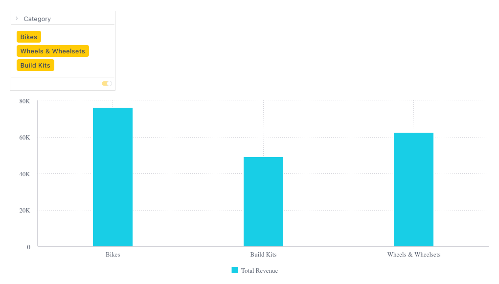
Now you can use the filter tile and see how it filters the top chart.

# Filtering multiple charts
You can also filter more than one chart using the same filter tiles.
In our case, since all the groundwork is already set, all we need to do is add a filters property to the second chart that uses the same filters variable.
filters = {chartFilters}
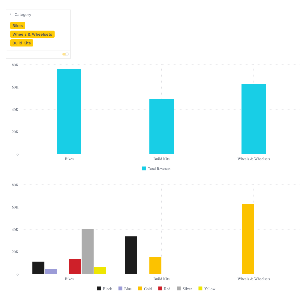
After adding that code, when you use the filter tile to set a filter, it filters both charts at the same time.

# Highlighting
Highlighting works similarly to filtering. In fact, we can use just about everything we’ve built to add filtering to our charts to add highlighting instead. You create a highlight by applying a filter. Just keep in mind that when highlighting you can only use filters where the filter attribute matches the grouping of the chart.
In our case, let’s change the filtering in the top chart to highlight instead. To do so, all we need to do is change the filters property to a highlights property. So now our top chart looks like this:
<Chart
  dataSet={DM.DataSource}
  chartType={'column'}
  dataOptions={{
    category: [DM.DimProducts.CategoryName],
    value: [
      measureFactory.sum(
        DM.Fact_Sale_orders.OrderRevenue,
        'Total Revenue'
      )
    ],
  }}
  highlights={chartFilters}
  styleOptions={{
    width: 1000,
    height: 400,
  }}
/>
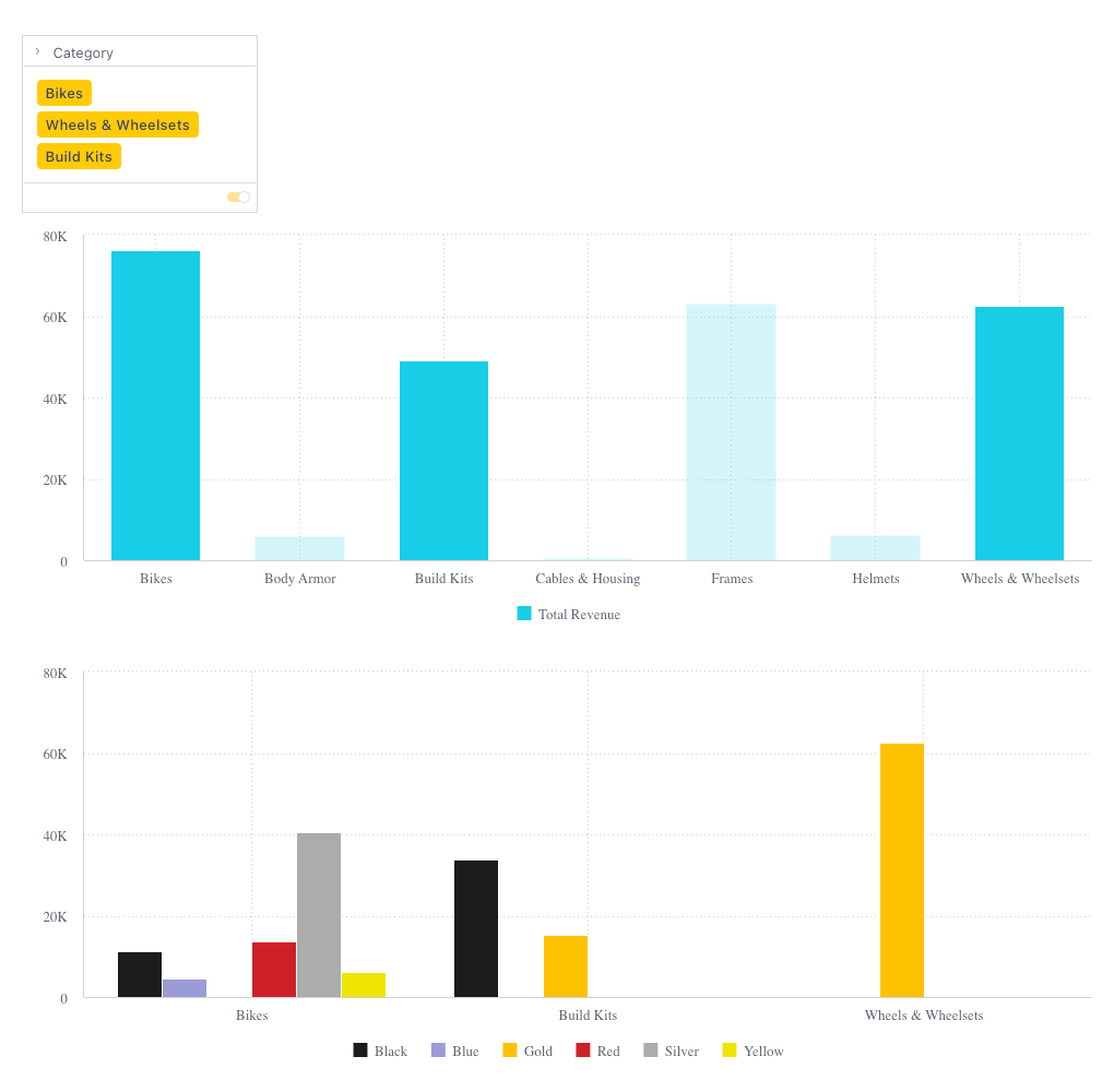
After changing that code, when you use the filter tile to set a filter, it highlights in the top chart and filters in the bottom chart.

TIP
The code up until this point can be found in branch 3a-filters-and-highlights (opens new window).
# Custom filtering UI
Now that we’ve seen how to build filtering and highlighting using filter tiles, let’s see what we can do so without the pre-built components.
Of course, filtering is not dependent on the UI of your application. You can perform filtering for all sorts of reasons without any UI at all. But for now, let’s allow our users to filter using a UI, but use a UI of our choosing.
For our UI components, let’s use Material UI (opens new window). We’ll need to begin by installing some packages:
npm install @mui/material @emotion/react @emotion/styled
Next, we’ll add a hardcoded array of all our product categories. Really, you’d want to query for this information, but we’re hardcoding it here to make our example a little simpler. So we’ll add this:
const productCategories = [
  'Bikes',
  'Body Armor',
  'Build Kits',
  'Cables & Housing',
  'Frames',
  'Helmets',
  'Wheels & Wheelsets',
];
After that, we’ll change a bit how we store the filter information. This will make it a bit easier to work with our chosen UI elements.
So, whereas before we had a state variable holding a Filter object, now we’ll use it to hold an array of strings that we want to filter on.
// Change this line
const [categoryFilter, setCategoryFilter] = useState<Filter | null>(null);

// To this line
const [categories, setCategories] = useState<string[]>([]);
And before where we had a memoized list of filters, now we’ll build our filter from our list of strings to filter on.
// Change these lines
const chartFilters = useMemo(
  () => (categoryFilter ? [categoryFilter] : []),
  [categoryFilter]
);

// To these lines
const chartFilters = useMemo(
  () =>
    categories
      ? [filterFactory.members(DM.DimProducts.CategoryName, categories)]
      : [],
  [categories]
);
We’ve done all that so we can easily work with a Material UI <ToggleButtonGroup>. So now let’s replace our filter tile component with a toggle button group.
<ToggleButtonGroup value={categories} onChange={handleCategoryChange}>
  {productCategories.map((productCategory) => (
    <ToggleButton key={productCategory} value={productCategory}>
      {productCategory}
    </ToggleButton>
  ))}
</ToggleButtonGroup>
Here we’re using the toggle button group to work with our categories state variable. To create the various toggle buttons, we loop through the array of product categories and create a button for each category.
Now all we have to do is create a function to handle users toggling buttons on and off. This function simply takes the categories set using the toggle buttons and uses them to set the new value of our categories state variable.
const handleCategoryChange = (
  _event: React.MouseEvent<HTMLElement>,
  newCategories: string[]
) => {
  setCategories(newCategories);
};
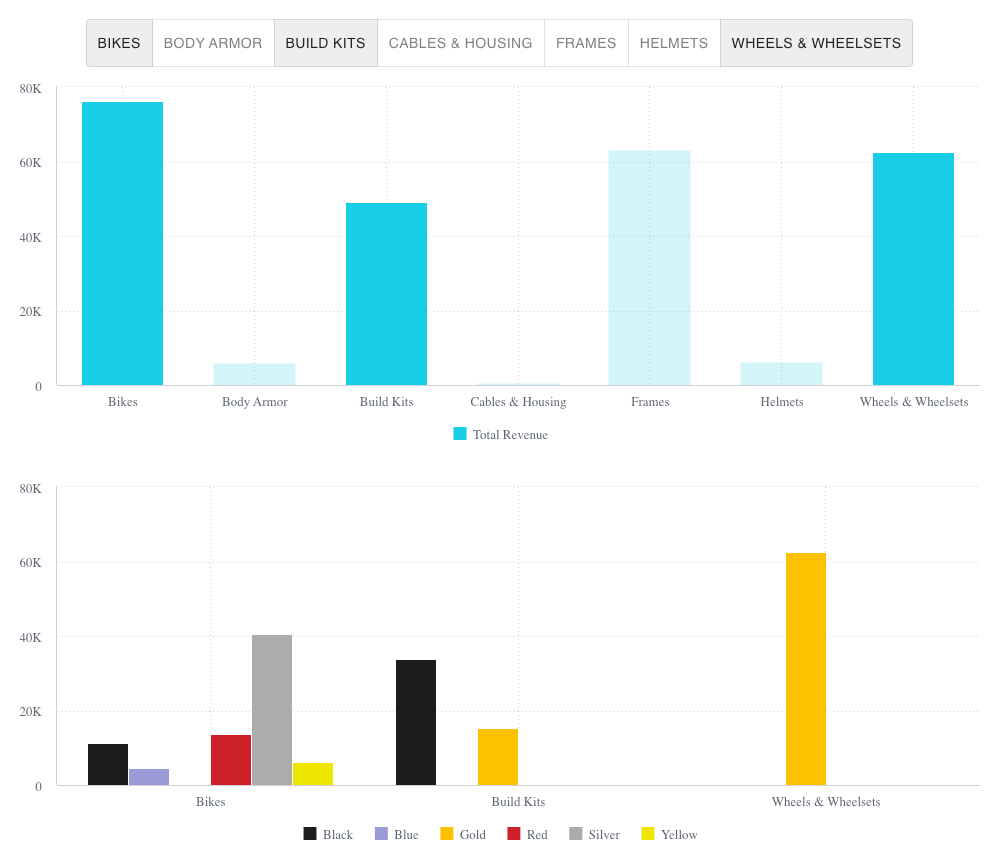
You can now go back to your charts and see that the functionality is the same, but with the toggle buttons controlling the highlighting and filtering of the charts.

TIP
The code up until this point can be found in branch 3b-filters-and-highlights (opens new window).
# Up next
At this point, you should know how to display the data you want in a chart and work with the way that data is displayed. In the next lesson you’ll learn how to take a bit more control of how a chart behaves. Go to Lesson 4.