# Lesson 4 | Callbacks
Chart callbacks are functions that run when specific events happen to a chart. You can use these callbacks to change the look and feel of a chart as well as add functionality to a chart.
# Before render
One of the events you can handle with a callback occurs just before a chart is ready to render. You can use this event to change the underlying chart options. Compose SDK uses the Highcharts (opens new window) charting library under the hood. You can use the HighchartsOptions object sent to the onBeforeRender() callback to change the chart options.
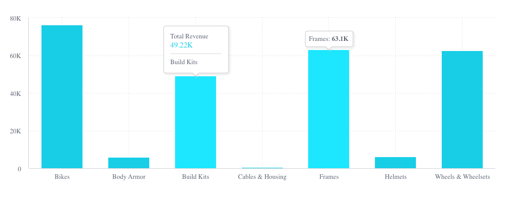
In our project, let’s change the way our charts display tooltips when a user hovers over one of the chart’s columns. To do that, let’s start by adding this callback to the top chart’s properties.
onBeforeRender={(options: HighchartsOptions) => {
  if (options.tooltip) {
    options.tooltip.formatter = function () {
      const value = (
        this.y && this.y !== 0 ? this.y / 1000 : 0
      ).toFixed(1);
      return `${this.x}: <b>${value}K</b>`;
    };
  }
  return options;
}}
Here you can see that the callback function receives the HighchartsOptions object. Our function manipulates that object and then returns the changed object to be used as the chart’s options.
In our case, we check if our chart has a tooltip. If it does, we add a formatter function to define the contents of the tooltip. Here we take the raw Y-value and divide it by 1000, keeping one digit after the decimal. Then we return a string literal with the format we want for our condensed tooltip.
When users hover over a chart now, they’ll see the tooltip on the right in the image below instead of the one on the left.

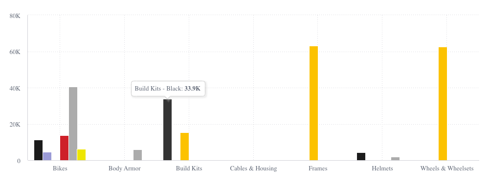
We can do something similar for the bottom chart. But since that chart is broken down further, let’s add some additional information to the tooltip by adding this callback.
onBeforeRender={(options: HighchartsOptions) => {
  if (options.tooltip) {
    options.tooltip.formatter = function () {
      const value = (
        this.y && this.y !== 0 ? this.y / 1000 : 0
      ).toFixed(1);
      return `${this.x} - ${this.series.name}: <b>${value}K</b>`;
    };
  }
  return options;
}}
This is very similar to the callback that we added to the top chart. The difference here is that we’ve added the series name to the formatter function, which results in a tooltip that looks like this:

TIP
The code up until this point can be found in branch 4a-callbacks (opens new window).
# Data point click
In addition to the before render callback, there are other callbacks you can use to handle user interactions with a chart. To see how to use these, we’ll build an interaction that happens when a user clicks a data point.
In our project, we’ll add a handler to the top chart that handles clicks on the data columns. When a user clicks one of the columns, we’ll use a handler to toggle the highlighting of that column in the top chart and the filtering of that group in the bottom chart. While we’re at it, we’ll have the click also toggle the corresponding toggle button on or off.
To do that, let’s add this callback to the top chart’s properties.
onDataPointClick={(point: DataPoint) => {
  const category = point.categoryValue as string;
  setCategories((categories) =>
    categories.includes(category)
      ? categories.filter((item) => item !== (category as string))
      : [...categories, category as string]
  );
}}
Here, the callback gets the current category that was clicked. It then checks if the clicked category is already in the array of categories we store in our state variable. If the clicked category is already in the array, we remove it. If the clicked category is not yet in the list, we add it. Since we’re using the same array as the toggle buttons, clicking on the categories in the charts, will also affect which toggle buttons are selected.
TIP
The code up until this point can be found in branch 4b-callbacks (opens new window).
# Up next
At this point, you’ve learned the basics of working with charts and their properties. In the next lesson, you’ll learn how to dynamically change the data displayed in a chart and the layout of the chart itself. Go to Lesson 5.