# Lesson 2 | Chart data
In this lesson you’ll learn how to add more data to your chart. You’ll learn to work with the axes and labels to better indicate what data your chart is showing. You’ll also learn to group the data in a chart.
# Duplicate chart
Let’s begin by duplicating our current chart. Since we’ll now have two components in your return statement, make sure to wrap them in a React fragment.
At this point your code should look something like this, which should cause you to see two of the same chart on the page:
return (
  <>
    <Chart
      // Chart details here
    />
    <Chart
      // Chart details here
    />
  </>
);
# Multiple values
On the first chart, let’s add a second value in addition to the total sale order revenue. You might have noticed that both the category and value properties are arrays. That’s because we can have multiple categories and multiple values.
In this case, we want to add the total sale order quantity as a value. To do that, all we need to do is use a measure function to create a new value and add it to the dataOptions.value array. Each of the values in the array are MeasureColumn types.
dataOptions={{
  category: [DM.DimProducts.CategoryName],
  value: [
    measureFactory.sum(DM.Fact_Sale_orders.OrderRevenue),
    measureFactory.sum(DM.Fact_Sale_orders.OrderQty),
  ],
}}
If you take a look at your charts, you’ll see something a bit strange. The sale order quantity data doesn’t seem to show up.
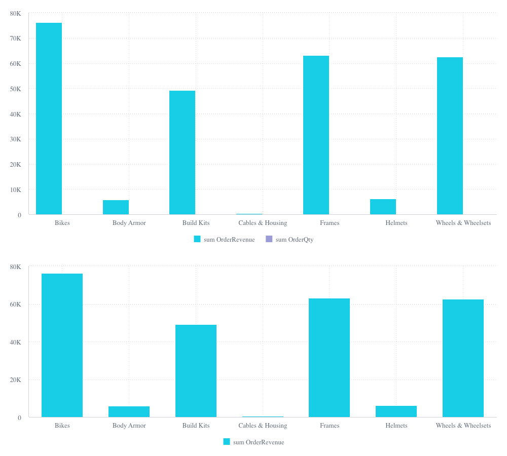
But if you have a keen eye, you might have noticed that the top chart’s columns are now narrower than they were before and the order quantity was added to the chart’s legend.
This should tip us off as to the problem here. The quantities are showing up, but they’re being measured on the same scale as the revenue. Since sales revenue is many times greater than sales quantity, the quantity is too small to be seen.
# Styled columns
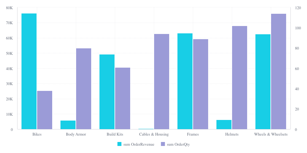
To remedy this situation, we can add a second Y-axis for the quantity. We’ll do this by adding a StyledMeasureColumn for our second measure. Doing this lets us add the option to show the second value on an additional Y-axis, which appears on the right side of the chart.
dataOptions={{
  category: [DM.DimProducts.CategoryName],
  value: [
    measureFactory.sum(DM.Fact_Sale_orders.OrderRevenue),
    {
      column: measureFactory.sum(DM.Fact_Sale_orders.OrderQty),
      showOnRightAxis: true,
    },
  ],
}}
That should give you something that looks like this:
# Labels
Okay, that’s already a bit better because we can see the quantity data. But it’s still not crystal clear as to which Y-axis belongs to which set of values. And while we’re at it, we can clean up the names of the values in the legend.
We can do this quite easily. First we’ll clean up the legend by adding a name when we create our measures. We’ll do this both times we call the measureFactory.sum() function.
dataOptions={{
  category: [DM.DimProducts.CategoryName],
  value: [
    measureFactory.sum(DM.Fact_Sale_orders.OrderRevenue, 'Total Revenue'),
    {
      column: measureFactory.sum(
        DM.Fact_Sale_orders.OrderQty,
        'Total Order Quantity'
      ),
      showOnRightAxis: true,
    },
  ],
}}
And we can add labels to the Y-axes using style options.
styleOptions={{
  width: 1000,
  height: 400,
  yAxis: { title: { enabled: true, text: 'Revenue' } },
  y2Axis: { title: { enabled: true, text: 'Quantity' } },
}}
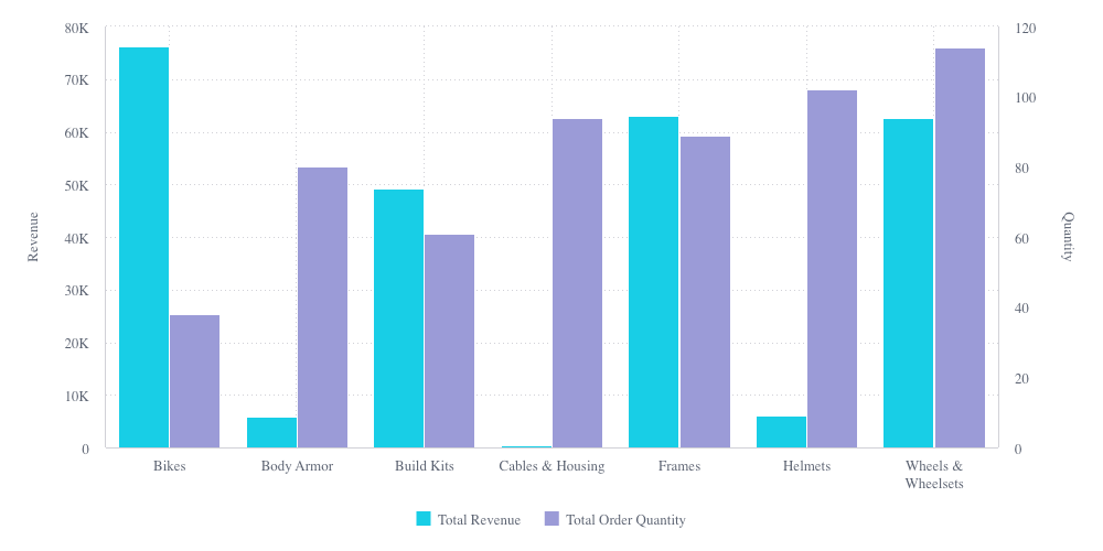
Now you should have a chart that looks like this, including clear axes labels and a cleaned up legend.
TIP
The code up until this point can be found in branch 2a-chart-data (opens new window).
# Break by
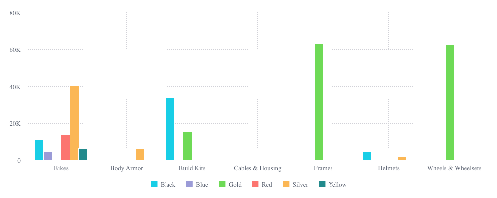
Now let’s turn our attention to the bottom chart on the page. Let’s break down each of the categories in the chart by color.
To do so, all we need to do is add the dataOptions.breakBy property to the chart with the attribute we want to break on.
You know the drill by now. We use the imported data model to get the attribute and wrap it in an array.
dataOptions={{
  category: [DM.DimProducts.CategoryName],
  value: [measureFactory.sum(DM.Fact_Sale_orders.OrderRevenue)],
  breakBy: [DM.DimProducts.Color],
}}
That should give you a chart that looks like this:
# Color map
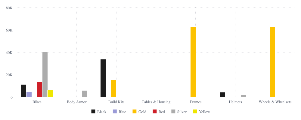
Our chart is looking pretty good except for the incongruity between the column colors and the product colors they’re representing. It would probably be better for blue products to be represented by blue columns instead of purple ones.
We can easily fix this using a series-to-color map. This map does exactly what its name implies. It maps series of data to colors on a chart. In our case, we want each of our product colors to be represented by a corresponding hex color in the chart.
We can do that by adding a seriesToColorMap object to our dataOptions, where the object’s properties are the series we broke our data by and their values are corresponding color hex codes or named colors (opens new window)::
dataOptions={{
  category: [DM.DimProducts.CategoryName],
  value: [measureFactory.sum(DM.Fact_Sale_orders.OrderRevenue)],
  breakBy: [DM.DimProducts.Color],
  seriesToColorMap: {
    Black: '#1b1b1b',
    Blue: '#0000cd',
    Gold: '#fcc200',
    Red: '#ce2029',
    Silver: '#acacac',
    Yellow: '#eee600'
  },
}}
Now our chart should look like this, with the colors matching:
TIP
The code up until this point can be found in branch 2b-chart-data (opens new window).
# Up next
By now, you should feel pretty comfortable populating charts with data. In the next lesson you’ll learn how to filter and highlight the chart data. Go to Lesson 3.