# Class ChartWidgetComponent
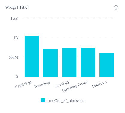
The Chart Widget component extending ChartComponent to support widget style options.
# Example
<csdk-chart-widget
  [chartType]="chartWidget.chartType"
  [dataSource]="chartWidget.dataSource"
  [dataOptions]="chartWidget.dataOptions"
  [highlights]="filters"
  [title]="chartWidget.title"
  [description]="chartWidget.description"
  [beforeRender]="onBeforeRender"
  (dataPointClick)="logArguments($event)"
  (dataPointContextMenu)="logArguments($event)"
  (dataPointsSelect)="logArguments($event)"
/>
import { Component } from '@angular/core';
import { ChartType } from '@sisense/sdk-ui-angular';
import { filterFactory } from '@sisense/sdk-data';
import * as DM from '../../assets/sample-healthcare-model';

@Component({
  selector: 'app-widgets',
  templateUrl: './widgets.component.html',
  styleUrls: ['./widgets.component.scss'],
})
export class WidgetsComponent {
  filters = [filterFactory.members(DM.Divisions.Divison_name, ['Cardiology', 'Neurology'])];
  chartWidget = {
    chartType: 'column' as ChartType,
    dataSource: DM.DataSource,
    dataOptions: {
      category: [DM.Divisions.Divison_name],
      value: [measureFactory.sum(DM.Admissions.Cost_of_admission)],
      breakBy: [],
    },
    title: 'Chart Title',
    description: 'Chart Description',
  };
 logArguments(...args: any[]) {
  console.log(args);
}

onBeforeRender(options: any) {
  console.log('beforeRender');
  console.log(options);
  return options;
}

}

# Implements
AfterViewInitOnChangesOnDestroy
# Constructors
# constructor
new ChartWidgetComponent(
sisenseContextService,themeService):ChartWidgetComponent
# Parameters
| Parameter | Type |
|---|---|
sisenseContextService | SisenseContextService |
themeService | ThemeService |
# Returns
# Properties
# Data
# dataSource
dataSource:
DataSource|undefined
Data source the query is run against - e.g. Sample ECommerce
If not specified, the query will use the defaultDataSource specified in the parent Sisense Context.
# filters
filters:
FilterRelations|Filter[] |undefined
Filters that will slice query results
# highlights
highlights:
Filter[] |undefined
Highlight filters that will highlight results that pass filter criteria
# Chart
# chartType
chartType:
ChartType
Default chart type of each series
# dataOptions
dataOptions:
ChartDataOptions
Configurations for how to interpret and present the data passed to the chart
# Widget
# description
description:
string|undefined
Description of the widget
# highlightSelectionDisabled
highlightSelectionDisabled:
boolean|undefined
Boolean flag whether selecting data points triggers highlight filter of the selected data
Recommended to turn on when the Chart Widget component is enhanced with data drilldown by the Drilldown Widget component
If not specified, the default value is false
# styleOptions
styleOptions:
ChartWidgetStyleOptions|undefined
Style options for both the chart and widget including the widget header
# title
title:
string|undefined
Title of the widget
# Callbacks
# beforeRender
beforeRender:
BeforeRenderHandler|IndicatorBeforeRenderHandler|undefined
A callback that allows you to customize the underlying chart element before it is rendered. The returned options are then used when rendering the chart.
This callback is not supported for Areamap Chart, Scattermap Chart, Table, and PivotTable.
# dataPointClick
dataPointClick:
EventEmitter<ChartDataPointClickEvent>
Click handler callback for a data point
# dataPointContextMenu
dataPointContextMenu:
EventEmitter<ChartDataPointContextMenuEvent>
Context menu handler callback for a data point
# dataPointsSelect
dataPointsSelect:
EventEmitter<ChartDataPointsEvent>
Handler callback for selection of multiple data points
# dataReady
dataReady: (
data) =>Data|undefined
A callback that allows to modify data immediately after it has been retrieved. Can be used to inject modification of queried data.