# Class ThemeProvider
Theme provider, which allows you to adjust the look and feel of child components.
Components not wrapped in a theme provider use the current theme from the connected Fusion instance by default.
# Example
Example of a theme provider, which changes the colors and font of the nested indicator chart:
<template>
  <ThemeProvider :theme="customTheme">
    <IndicatorChart .... />
  </ThemeProvider>
</template>

<script>
import { ref } from 'vue';
import ThemeProvider from './ThemeProvider.vue';

export default {
  components: { ThemeProvider },
  setup() {
    const customTheme = ref({
        chart: {
          backgroundColor: '#333333',
          textColor: 'orange',
          secondaryTextColor: 'purple',
        },
        typography: {
          fontFamily: 'impact',
        },
    });

    return { customTheme };
  }
};
</script>
Alternatively, to fetch theme settings based on a theme ID:
<template>
  <ThemeProvider :theme="'theme_id_string'">
    <!-- Components that will use the fetched theme settings -->
  </ThemeProvider>
</template>
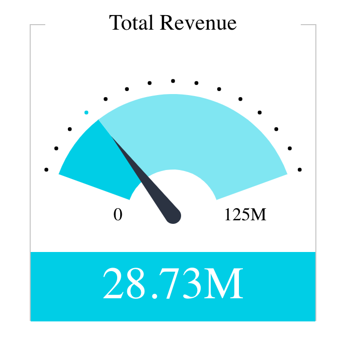
Indicator chart with custom theme settings:

For comparison, indicator chart with default theme settings:

# See
ThemeSettings and IndicatorChart
# Param
Theme provider props
# Properties
# theme
readonlytheme?:ThemeSettings|string
Theme settings object for custom themes or a string identifier to fetch theme settings. When provided as an object, it merges with the default theme settings. When provided as a string, it attempts to fetch theme settings using the provided ID.