# Theming & Styling
This guide demonstrates the various ways you can use themes and styles to customize the look and feel of Compose SDK charts.
To customize the way charts look, use one of the following, depending on what type of customization you want:
# Example Charts
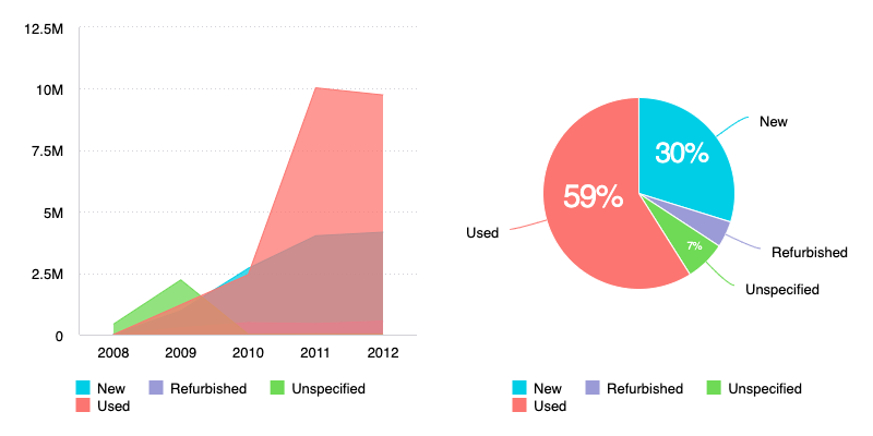
In this guide, we refer to the following charts to demonstrate the usage of theme and style options.

import { AreaChart, PieChart } from '@sisense/sdk-ui';
import * as DM from './sample-ecommerce';
import { measureFactory } from '@sisense/sdk-data';

function App() {
  return (
    <div style={{ display: 'flex' }}>
      <AreaChart
        dataSet={DM.DataSource}
        dataOptions={{
          category: [{ column: DM.Commerce.Date.Years }],
          value: [measureFactory.sum(DM.Commerce.Revenue, 'Total Revenue')],
          breakBy: [DM.Commerce.Condition],
        }}
      />
      <PieChart
        dataSet={DM.DataSource}
        dataOptions={{
          category: [DM.Commerce.Condition],
          value: [measureFactory.sum(DM.Commerce.Revenue, 'Total Revenue')],
        }}
      />
    </div>
  );
}

export default App;
# ThemeProvider / ThemeService
Use a ThemeProvider (React and Vue) or ThemeService (Angular) to apply a consistent look and feel to multiple charts at once. All charts nested under the ThemeProvider or ThemeService inherit its theme settings.
A theme contains properties for setting styling, such as:
- Chart background and text colors
- General background and button colors
- Color palettes
- Fonts
- AI Chatbot look and feel
You can set the theme using a ThemeSettings object or you can use an existing theme from your Fusion instance (opens new window) by providing a ThemeOid. If you don't include a ThemeProvider or ThemeService in your code, the default theme from your Fusion instance is used.
Note that style settings you set on the theme level may be overridden by other settings that you set on the chart level.
# Theme Example
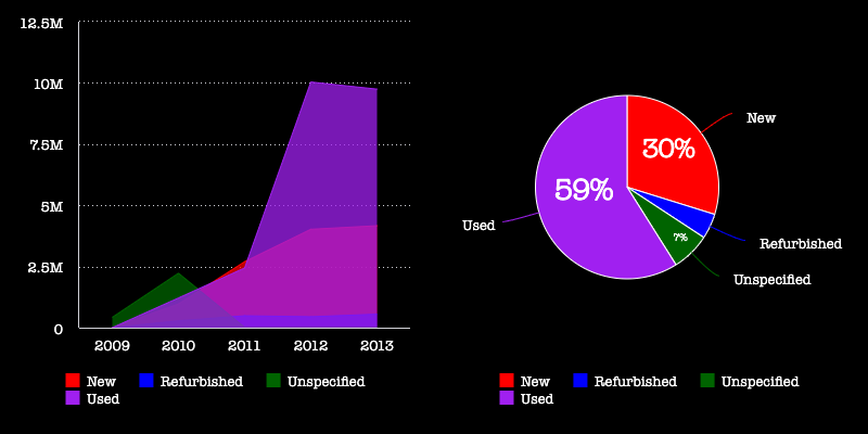
As an example, let's change the look and feel of our charts using the following ThemeSettings to change chart colors, fonts, and color palette:
<ThemeProvider
  theme={{
    chart: {
      backgroundColor: 'black',
      textColor: 'white',
    },
    typography: {
      fontFamily: 'American Typewriter',
    },
    palette: {
      variantColors: ['#FF0000', '#0000FF', '#006400', '#A020F0'],
    },
  }}
>
  {/* Chart code nested in here */}
</ThemeProvider>

# Chart StyleOptions
Use the StyleOptions property of a chart to set styling on particular charts.
The exact style options you can set for a chart depend on the type of chart you are styling, but in general, the kinds of styling you can do with chart style options include:
- Chart size
- Legend location
- Axes options
- Subtype (for example, whether a column chart is stacked)
# StyleOptions Example
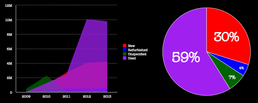
As an example, let's change the look and feel of our charts using the following StyleOptions to change the chart sizes, chart legends, and chart labels:
// AreaChart

styleOptions={{
  width: 600,
  height: 400,
  legend: { enabled: true, position: 'right' },
}}
// PieChart

styleOptions={{
  width: 400,
  height: 400,
  labels: { enabled: true, categories: false, value: false },
  legend: { enabled: false },
}}

# Highcharts Options
Use the HighChartsOptions parameter of the onBeforeRender() callback to set styling (and other) options of the underlying Highcharts chart (opens new window). With the onBeforeRender() callback function, you can read, modify, and return the options that will be used when rendering your chart.
Use HighChartsOptions when the style settings you want to use are not available as part of a theme or the chart style options. You can also use HighChartsOptions to override styles you already set as part of a theme or the chart style options.
# Highcharts Options Example
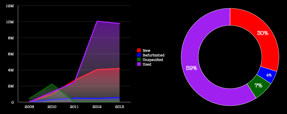
As an example, let's change the look and feel of our charts using the following HighchartsOptions to add a gradient to the area chart and to hollow out the center of the pie chart:
// AreaChart

onBeforeRender={(options: HighchartsOptions) => {
  options.series!.forEach((s: any) => {
    s.lineWidth = 4;
    s.fillColor = {
      linearGradient: { x1: 0, x2: 0, y1: 0, y2: 1 },
      stops: [
        [0, s.color + 90],
        [1, 'rgba(255, 255, 255, 0.1)'],
      ],
    };
  });
  return options;
}}
// PieChart

onBeforeRender={(options: HighchartsOptions) => {
  options.plotOptions!.pie!.innerSize = '65%';
  return options;
}}
