# 2 | Custom Context Menu
In this section, you'll learn how to customize the look and feel of a drilldown chart by providing a custom context menu.
You can use any components of you choose as the basis for a custom context menu. In this guide, we use the Material UI Menu component (opens new window) as the basis for the custom context menu.
# Props
A context menu has the following properties:
position: The position at which to display the context menuitemsSections: The items for the context menu, organized by section (more on this below)children: Additional content, if there is any, to be displayed at the bottom of the context menucloseContextMenu: Function to run when the context menu is closed
So the first step in creating a custom context menu is to create a component with these properties:
export const CustomContextMenu = ({
  position,
  itemSections,
  children,
  closeContextMenu
}: ContextMenuProps) => {
    // Component code goes here
};
# Menu Component
Next, you can start to apply some of these properties in your component code:
- Use
positionto determine if the context menu is open and to place it in the correct location - Use
closeContextMenuto determine what happens when the context menu is closed - Place any children that are passed through to the component at the bottom of your context menu
Using the <Menu> component, your code would look something like this:
const open = !!position;

return (
  <Menu
    anchorReference="anchorPosition"
    anchorPosition={position ?? { left: 0, top: 0 }}
    open={open}
    onClose={closeContextMenu}
  >
    {/* Menu items go here */}
    {children}
  </Menu>
);
# Menu Content
Finally, you need to add the drilldown options to the context menu. Do that by applying the information in itemSections to the contents of the <Menu> component.
The itemSections array contains information about the current drilldown dimension and the remaining possible dimensions to drill down on.
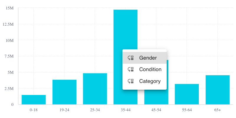
For example, consider the chart we discussed in the previous section where the initialDimension is Age Range and the drilldownDimensions are Gender, Condition, and Category. Before drilling down on the chart, the itemSections array contains the following:
[
  {
      sectionTitle: 'AgeRange',
  },
  {
      sectionTitle: 'Drill',
      items: [
        { caption: 'Gender' },
        { caption: 'Condition' },
        { caption: 'Category' }
      ],
  },
];
Then after drilling down on Condition, the itemSections array contains the following:
[
    {
        sectionTitle: 'Condition',
    },
    {
        sectionTitle: 'Drill',
        items: [
          { caption: 'Gender' },
          { caption: 'Category' }
        ],
    },
];
Now that you understand the contents of the itemSections array, you can decide how you want to use it to populate your menu options. You can of course choose to do this however you like.
Here, we ignore the current drilldown dimension and just create a menu item for each remaining drill category.
Each menu item contains an icon and the caption of the drilldown dimension. When the item is clicked, the context menu is closed and the onClick function from the item object is called to perform the drill down.
{!!itemSections &&
  !!(itemSections as Array<{ items: Array<object> }>)[1].items.length &&
  itemSections?.map(({ items }) =>
    items?.map((item) => (
      <MenuItem
        key={item.key ?? item.caption}
        onClick={() => {
          closeContextMenu();
          item.onClick?.();
        }}
      >
        <ListItemIcon>
          <MoveDown fontSize='small' />
        </ListItemIcon>
        <ListItemText> {item.caption}</ListItemText>
      </MenuItem>
    ))
  )
}
If there are no remaining drilldown dimensions, you may want to create a single menu item alerting the user that they cannot drill down any further.
{(!itemSections ||
  !(itemSections as Array<{ items: Array<object> }>)[1].items.length) && (
  <MenuItem key={'none'}>
    <ListItemText> {'Cannot drill down any further'}</ListItemText>
  </MenuItem>
)}
# Apply
Once you have a custom context menu component, you need to apply it to your chart. All you need to do is to add a config property to the <DrilldownWidget> that wraps the chart. Within the config object, set the contextMenuComponent property to the component you created.
<DrilldownWidget
  initialDimension={DM.Commerce.AgeRange}
  drilldownDimensions={[
    DM.Commerce.Gender,
    DM.Commerce.Condition,
    DM.Category.Category,
  ]}
  config={{
    contextMenuComponent: CustomContextMenu,
  }}
>
# Results
At this point, your custom context menu is ready for action. When you select a data point in your chart, you should see a context menu that looks like this:

# Next Up
In this section you learned how to create a custom context menu. In the next section, you'll continue to customize the drilldown experience by creating a custom breadcrumbs component.
Go to the next lesson.
# Full Code
For your convenience, here is the full code for our custom context menu component:
import Menu from '@mui/material/Menu';
import ListItemText from '@mui/material/ListItemText';
import ListItemIcon from '@mui/material/ListItemIcon';
import MenuItem from '@mui/material/MenuItem';
import MoveDown from '@mui/icons-material/MoveDown';
import { ContextMenuProps } from '@sisense/sdk-ui';

export const CustomContextMenu = ({
  position,
  itemSections,
  children,
  closeContextMenu,
}: ContextMenuProps) => {
  const open = !!position;

  return (
    <Menu
      anchorReference='anchorPosition'
      anchorPosition={position ?? { left: 0, top: 0 }}
      open={open}
      onClose={closeContextMenu}
    >
      {!!itemSections &&
        !!(itemSections as Array<{ items: Array<object> }>)[1].items.length &&
        itemSections?.map(({ items }) =>
          items?.map((item) => (
            <MenuItem
              key={item.key ?? item.caption}
              onClick={() => {
                closeContextMenu();
                item.onClick?.();
              }}
            >
              <ListItemIcon>
                <MoveDown fontSize='small' />
              </ListItemIcon>
              <ListItemText> {item.caption}</ListItemText>
            </MenuItem>
          ))
        )}
      {(!itemSections ||
        !(itemSections as Array<{ items: Array<object> }>)[1].items.length) && (
        <MenuItem key={'none'}>
          <ListItemText> {'Cannot drill down any further'}</ListItemText>
        </MenuItem>
      )}
      {children}
    </Menu>
  );
};