# Indicator Object
The indicatorInstance object represents an Indicator widget.
You can modify the styling of an Indicator widget through the indicatorInstance object's setOptions method.
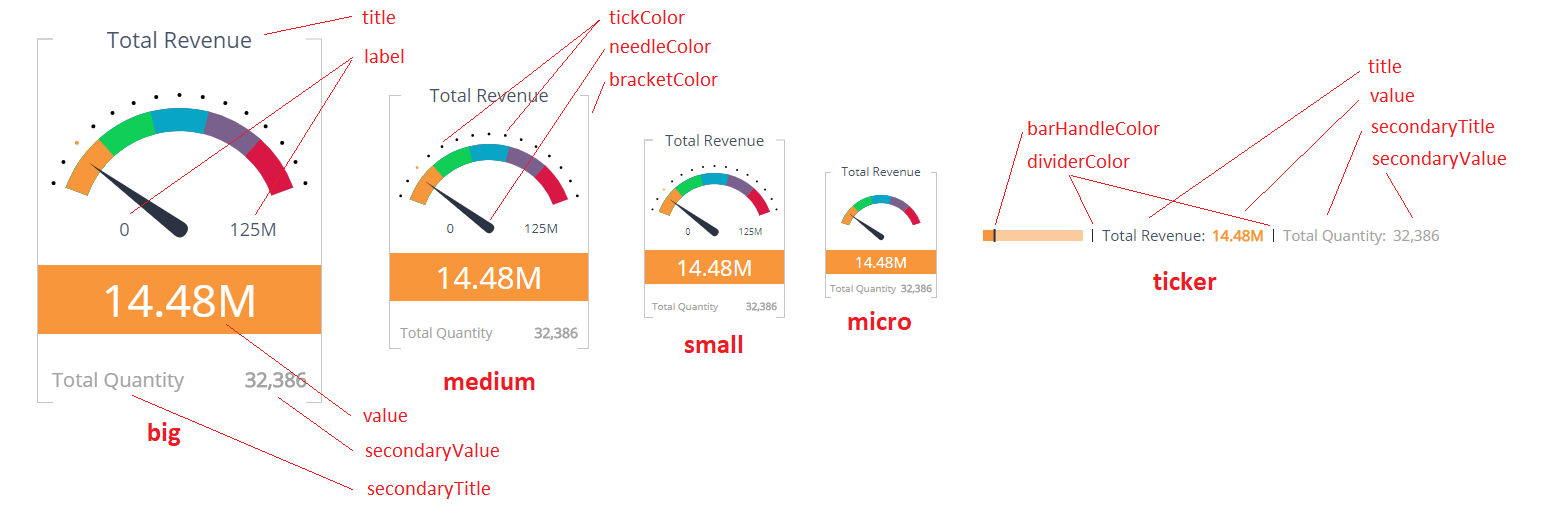
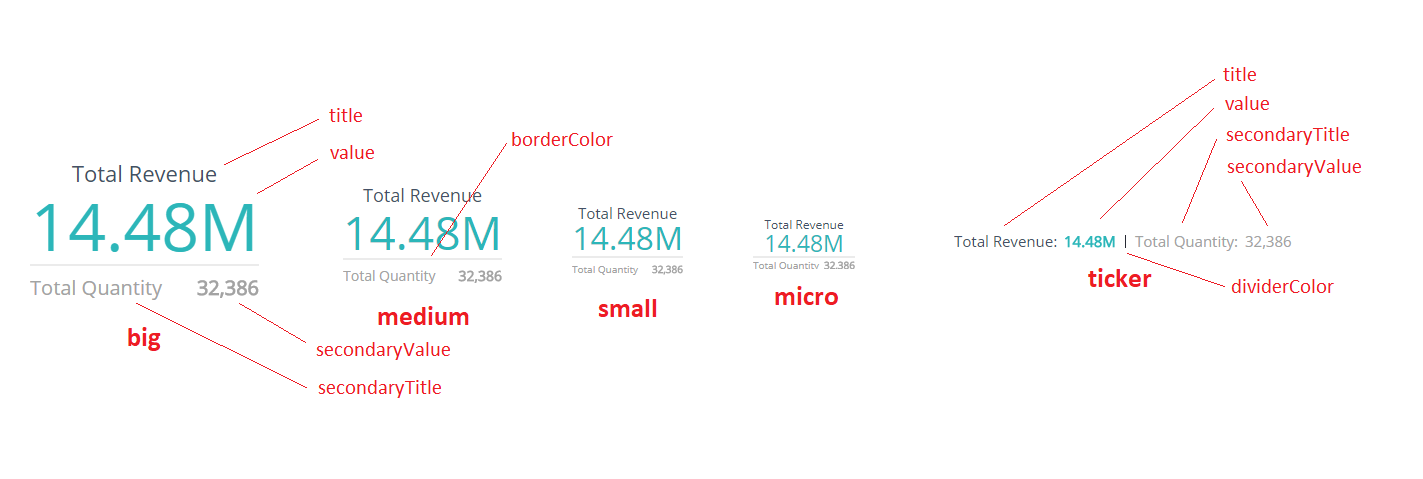
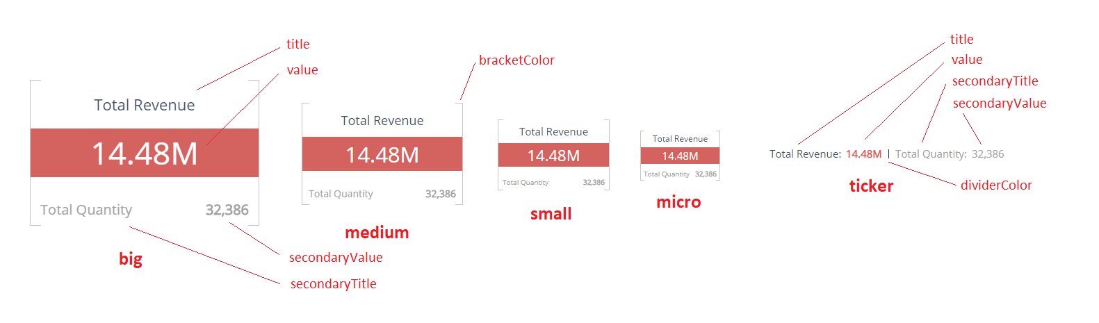
The following images display labels that define all the elements you can customize for each type of Indicator widget.
# Gauge
# Numeric Simple
# Numeric Bar
# Methods
# setOptions
indicatorInstance.setOptions(type, options)
Defines styling options for an Indicator widgets.
Arguments
| Name | Type | Required | Description |
|---|---|---|---|
type | string | Yes | One of: gauge, numericSimple, numericBar, ticker |
options | IndicatorOptions | Yes | Indicator styling configuration |
Returns
N/A
Example
widget.on('initialized', function(w) {
    var options = {
        title: {
            fontFamily: 'Helvetica, sans-serif',
            fontWeight: 'bold',
            fontSizes: {
                big: 40,
                medium: 30
            },
            color: '#29aba4'
        },
        value: {
            fontFamily: 'Helvetica, sans-serif',
            fontStyle: 'italic',
            color: '#e9e0d6'
        },
        bracketColor: '#f2ae72'
    };
    w.indicatorInstance.setOptions('numericBar', options);
});
# Types
# IndicatorOptions
These properties applies to all Indicator widget types:
| Name | Type | Description |
|---|---|---|
title | IndicatorComponentStyle | Set of options to style the title section of an Indicator widget |
value | IndicatorComponentStyle | Set of options to style the value section |
secondaryTitle | IndicatorComponentStyle | Set of options to style secondaryTitle section |
secondaryValue | IndicatorComponentStyle | Set of options to style secondaryValue section |
backgroundColor | string | Background color of the indicator widget |
Gauge Indicator widget specific properties:
| Name | Type | Description |
|---|---|---|
label | IndicatorComponentStyle | Set of options to style label sections |
needleColor | string | Color of the needle |
tickColor | string | Color of the ticks |
bracketColor | string | Color of the brackets |
Numeric Simple Indicator widget specific properties:
| Name | Type | Description |
|---|---|---|
borderColor | string | Color of the border |
Numeric Bar Indicator widget specific properties:
| Name | Type | Description |
|---|---|---|
bracketColor | string | Color of the brackets |
Ticker Indicator widget specific properties (Note, that ticker properties will be used by all the indicator types' tickers):
| Name | Type | Description |
|---|---|---|
dividerColor | string | Color of the divider |
barHandleColor | string | (only for gauge type) Color of the bar handle |
# IndicatorComponentStyle
Each element of the Indicator specified above can have the following style settings
| Name | Type | Description |
|---|---|---|
fontStyle | string | Specifies the font style. One of: normal, italic, oblique |
fontVariant | string | Specifies the font variant. One of: normal, small-caps |
fontWeight | string or integer | Specifies the font weight |
fontFamily | string | Specifies the font family. You can also specify it as a set of the main font and fallback fonts divided by a comma |
color | string | Specifies the color of the text |
fontSizes | object | (only for main types) Specifies font sizes for different indicator size variants |
fontSizes.big | string or integer | Specifies the font size for the big indicators, in pixels |
fontSizes.medium | string or integer | Specifies the font size for the medium indicators, in pixels |
fontSizes.small | string or integer | Specifies the font size for the small indicators, in pixels |
fontSizes.micro | string or integer | Specifies the font size for the micro indicators, in pixels |
fontSize | string or integer | (only for ticker type) Specifies the font size, in pixels |
Note: You can specify font sizes as a number or as a string (number plus 'px': 200px)